Role: UX/UI Designer
Challenge: Concept and design a mobile carsharing application for Uber
Solution: I developed and designed a carsharing application from initial research to high fidelity prototyping

Understanding our users
Our goal was to learn how, when and why people carshare.
We were curious:
When are people choosing to carshare?
What were their feelings about P2P carsharing?
How many of them owned a car and still carshared?
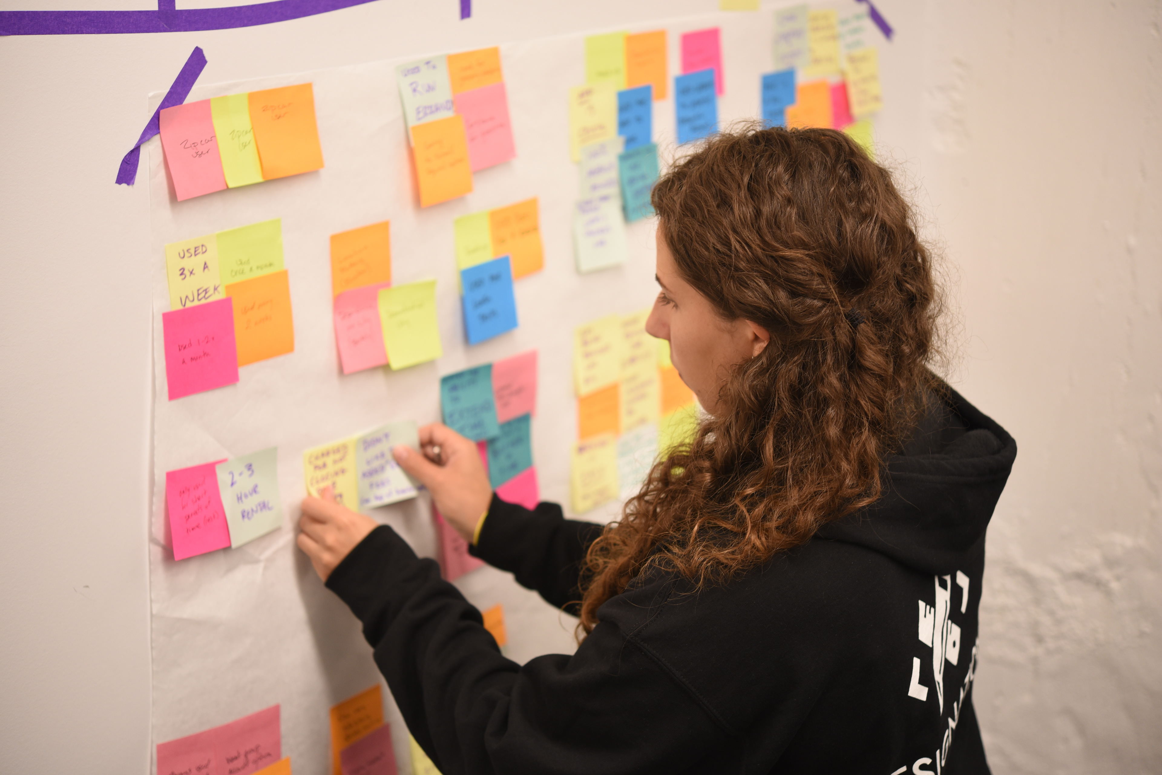
We organized interview insights into themes and needs.
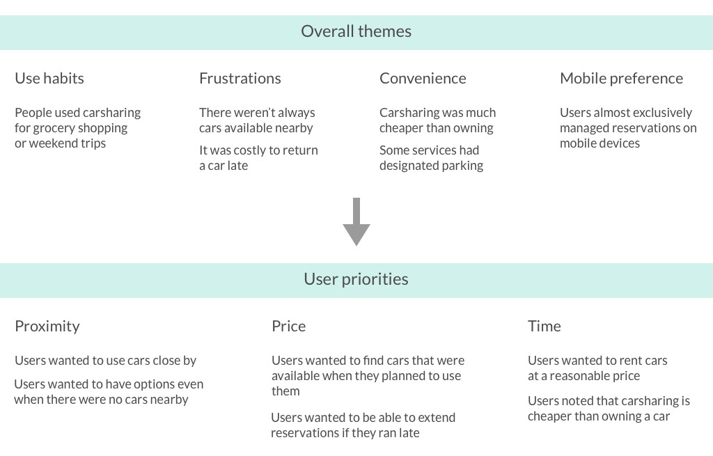
These themes and priorities helped us identify the people we were solving for and the problem to address:
How will we improve the carsharing experience so that we ensure users easily find cars that are close by, available when they need them, and at a price point that they can afford? Success is measured by the number of users who complete their bookings and become recurring users.

Erin was our primary persona and represented the majority of individuals we interviewed. Time, price and location, were her priorities. Rod was a secondary persona and though he was not our focus, we designed features with him in mind.
Once we identified and understood our personas, we decided to document Erin booking an UberShare. We wanted to understand what features make Erin’s life easier in a time sensitive situation.
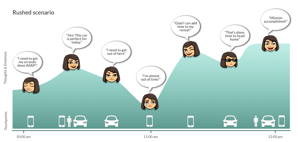
Considering Erin’s emotions in a rushed scenario revealed:
The stress that comes from running late
The relief of being able to extend a reservation
A user’s need to search for cars closest to them
The time extension and a map-based search features were direct results of this examination.
Testing ideas
We tested three paper prototypes to validate our assumptions features and test the flow.

After five concept tests, we received the following feedback:
Users liked to begin their search from the map view
One-way/round trip functionality was good, but a little confusing
Delivery/pickup options were great in a rush
In response to feedback that the filter was hard to find, we incorporated a more prominent filter button. Users also felt that the one-way/round trip functionality was unclear, so we added onboarding instructions.
We updated these features in an interactive digital wireframe using Axure. This round, we were specifically looking to address details that were too intricate to show with hand drawings.
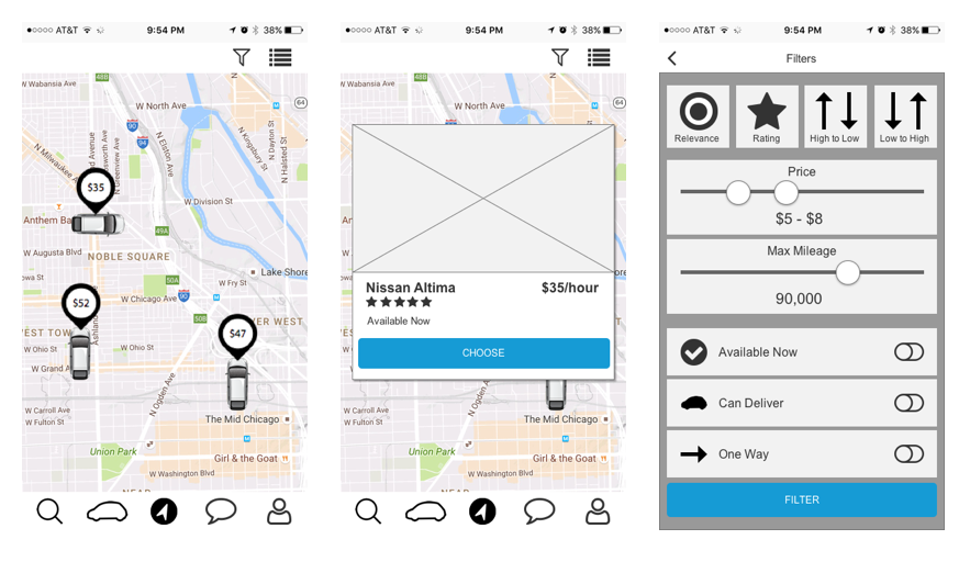
Map searching and filters were tested further using the interactive prototype.
At this point, we had built and tested our core functionality, so we solidified our app map to show where our key screens fit within the larger flow:
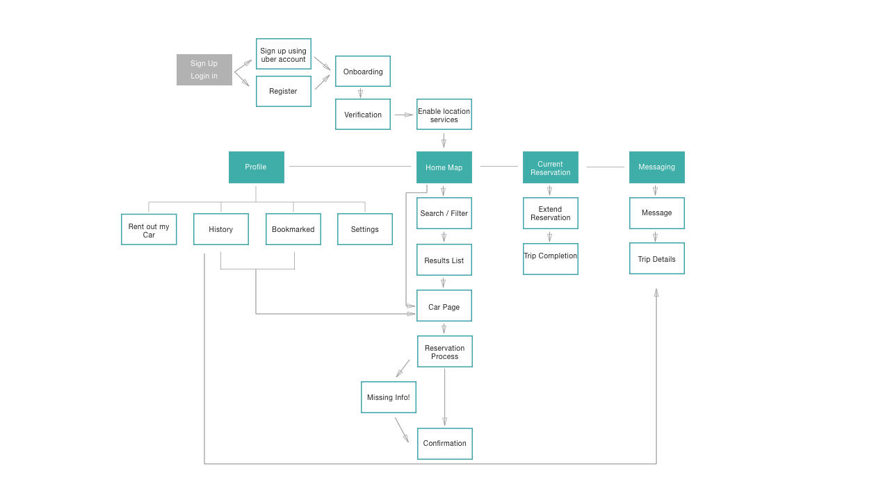
With the full picture defined, we noticed that we needed to reconsider the navigation between screens. We added back buttons and made sure the navigation was present wherever possible.
Creating the look
We were ready to add visual design. Before we diverged on possible directions, we reviewed the competitors again, this time for a way to visually differentiate UberShare.
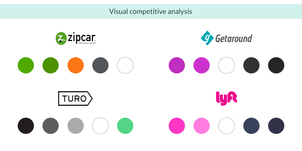
It was clear there were two themes of color palettes. By staying away from green- and pink-heavy palettes, we could set UberShare apart from its competitors.
I began by exploring what a rewarding design looked like for UberShare.

A blue, green, and gray palette paired well with the yellow highlight. It fit into the clean sophistication of the current uber brand and evoked a “grounded in technology” feel.
From here, I created two different style directions.
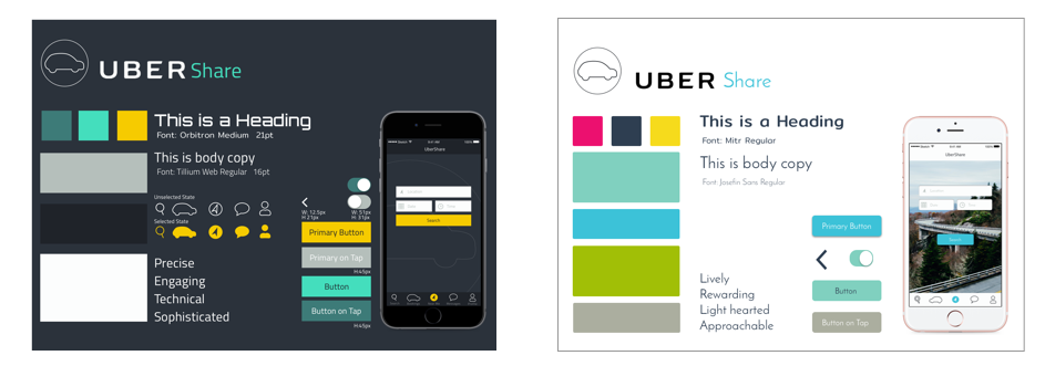
The first style was rewarding, sophisticated, and precise. To explore a different iteration of the color palette, I came up with a lighter approach that relied on photographs. It felt more lively, rewarding and approachable.
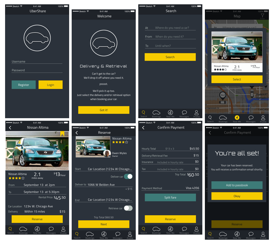
Final key screens from my UberShare interface
When finalizing my navigation, I found that it has been proven that a widely used icon may be vague because its meaning varies among uses. Adding labels to navigation reduced the user’s cognitive load and clarified the icons.
The result
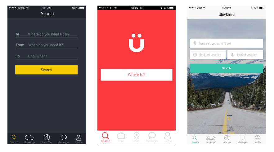
Example screens from my design (left), and my teammates’ designs (middle and right).
We conducted final testing and although users felt my UI was most usable, they felt my teammate’s design (right) was closer to the existing Uber brand. We let the feedback guide us, and moved forward with my teammate’s design, incorporating usability principles from my design.
Overall this project was an invaluable experience in completing the full journey from initial research and ideation to final high fidelity prototyping. As a UX focused designer, it was a great opportunity for me to participate in the visual design process and a great reminder of how to create UX that translates well for a UI team.